METAL TYPE


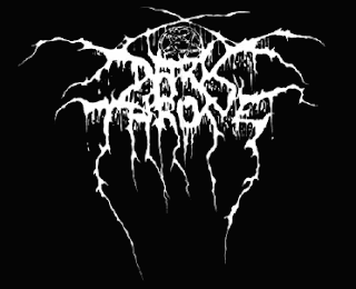


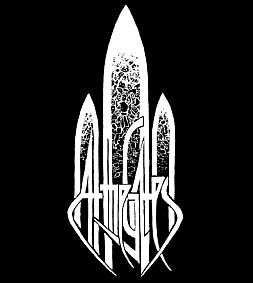
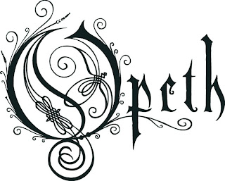

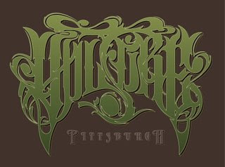
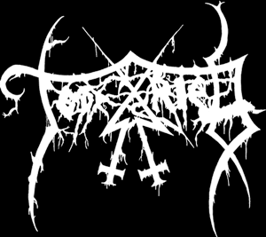

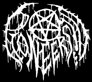
Does type have to be legible to convey meaning.? Can language be abstract and concise simultaneously? How does the context of hand lettered typography effect it's credibility?
Symmetry?Disposition? Why am I asking these questions? Well, for one I'd like to spark conversation on this blog. Secondly because graphic design is pretty fucking metal.

6 Comments:
Yes! Typography must communicate. Both verbally and visually. If visual overcomes the verbal, then how does it communicate its intended message. There is a tipping point when it becomes a visual communicative device.
let me preface this comment by saying that I hate splatter logos.
a lot.
but here is an awesome explanation of it by my buddy Scott Wygmans: Metal Master.
"i think that embodies metal
for real, i am bing 100% serious
cause metal is that gut wrenching, screaming feeling. when your at a show and all the noise and sweat and stink all jumbles together and all that matters is your favorite fuckin band is puking their blood and guts onto a microphone and your there
it doesnt matter if you can hear the lyrics, or know what their saying
its just that feeling
and when you cant read logos
its like that. its like a big "fuck you this is what we love" to everyone"
with an explanation like that, I can get behind them. I just wish that most of them weren't so bloody generic and poorly made.
I agree with victoria unreadable or hidden type does have its place, and metal is one great use, also where's Waldo, and more. But it would be a little more than impractical to open the newspaper to that.
over the years font development has progressed in two separate directions, drive for beautiful, clean legible types (swiss fonts, etc.), and the drive to create emotional fonts that portray the mood and meaning of that which they represent. having a super-hardcore looking illegible font seems like the only conceivable direction that a super-hardcore band, with (often times) indistinguishable lyrics could choose to go. whereas i am not necessarily attracted to such designs, i respect what they represent.
Check out this recent post on metal type.
http://www.underconsideration.com/brandnew/archives/in_brief_death_metal_branding.php
http://www.underconsideration.com/brandnew/archives/in_brief_death_metal_branding.php
Post a Comment
<< Home