type3kcad

This blog was established for the Typography 3 students of Kendall College of Art + Design.

Sunday, November 23, 2008

more overused fonts?

we already know that using papyrus and comic sans is a mortal sin, but i feel like there are some more typefaces that i wouldn't mind seeing less of.

optima is getting used too much. i used to think it was an ok typeface, but it's starting to look really dated.

zapfino! the default fancy typeface. to me zapfino has always been as bad as papyrus. the ascenders and descenders get all tangled and it takes up a crap load of space.

cracked! the default "grunge font." ugh just don't use it.

how does everyone else feel about this? 
what other typefaces should people abstain from using?

Thursday, November 13, 2008

Type popup book.

Here is another way of approaching the Idea of a type popup book.


The alphabet in volume is connected in the shape of an edition bearing the name of the character. It with an architectural aspect and the impact of the light makes it possible to better reveal volumes of the letters. Each letter is built on the same principle of folding and starting from a simple sheet A4 Bristol-board.


View a cool video of the book --HERE--

I think this book does a great job of using light and shadows, and a 3d environment. It is amazing what you see at different angels as the book pages are turned.

I found the black gloves a little funny though, but it is part of the presentation in the video.

What do you think about this popup book? Are there any letter you would change? Did you try making a letter in this style? because I tried.

I love how the 'E' changes as the book gets turned, but I think the A design could have been improved. I also do not like how the pages look when the book is closed, and I think the binding our class mate (sorry Im not good with names) used is better and would make this book look so much better when closed.

Wednesday, November 12, 2008

Can you kill the type?

I found this cool coin


And you can read about how it was made HERE.

After I read, this part stood out to me.

"In order to achieve the image I developed my own single-line font system. I let the line width change within the same character in order to evoke an underlying picture:"


Building on the previous post. Do you think this is an abuse of type?

I thought the Idea of a 'single-line font system' sounded very cool, but then I look close and I got the 'feeling' the type lost all its integrity. It is almost no longer and art but a systematic process that a machine would easily replace the talent and skill of a designer. Personally after I got over the 'oh that is awesome', it looked like a pen exploded and was making blotches all over.

Do you think the integrity of type was destroyed?

Tuesday, November 11, 2008

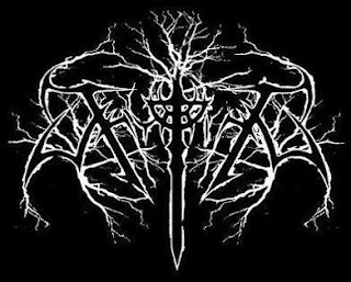
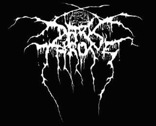
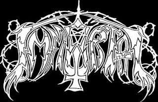
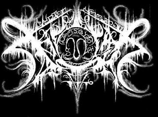
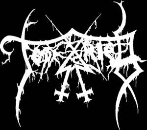
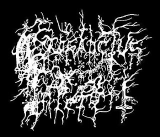
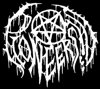
METAL TYPE


Does type have to be legible to convey meaning.? Can language be abstract and concise simultaneously? How does the context of hand lettered typography effect it's  credibility? 
 Symmetry?Disposition? Why am I asking these questions? Well, for one I'd like to spark conversation on this blog. Secondly because graphic design is pretty fucking metal. 

readable toast


This is so cool, its a toaster that you write a message on top 
and it burns it into the bread. Its also reusable so you can write a new message everyday. 

Sunday, November 09, 2008

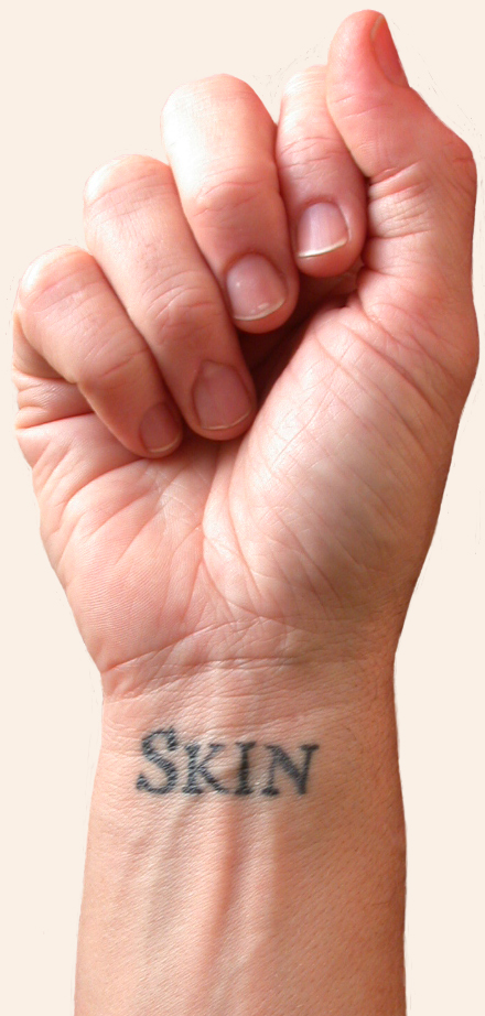
skin


This reminded me of future book. It's a book written one word at a time in tattoos.

click here for more

Tuesday, November 04, 2008

Meijer Gardens


I thought this was interesting at the Meijer Gardens. In case you can't see it correctly, it is a sculpture of a man sitting with his arms around his knees made out of type, obviously.

Monday, November 03, 2008


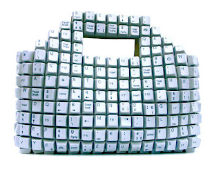
Thought this was interesting, I feel like it would be awkward to carry and noisy though. 

Sunday, November 02, 2008

animated typography

it won't let me post the video, so here's the address

http://vimeo.com/1185465